%201.svg)


Landing pages are key to converting visitors into leads or customers; however, common mistakes in landing page optimization often limit their effectiveness. From design flaws and cognitive overload to weak CTAs and poor mobile performance, even minor issues can drastically lower conversion rates. In this article, we’ll explore the most frequent landing page mistakes and show you how to fix them. These insights are crucial for marketers looking to improve performance in 2025 and beyond.
Common Landing Page Mistakes (And How to Fix Them)
Let us discuss the nine most common landing page mistakes and offer practical solutions to fix them. Addressing these issues can enhance user experience and boost your conversions, ensuring your landing page works as effectively as possible.
1. Slow Loading Time (Mistake + Solution)
A slow-loading landing page is one of the biggest reasons for high bounce rates. In fact, studies show that 53% of users will leave a page if it takes more than three seconds to load, which significantly affects your conversion rates and user experience. This is a classic example of how landing-page-error violations impact end user experience.
Solution:
To start fixing this problemfirst measure your current loading time using tools such as Google PageSpeed Insights, which provide detailed reports on your website’s performance and point areas for improvement. For example, a loading time under 3 secs is deemed good, with an ideal target being 1-2 seconds for the most promising user experience.

To improve your page speed, try these solutions:
- Compress your images using tools like TinyPNG to reduce file sizes without losing quality.
- Enable browser caching to store frequently accessed files locally, which can help speed up page loads for returning visitors.
- Minimize heavy scripts and plugins that might slow down your website. This includes removing any unnecessary JavaScript or third-party plugins.
- Use a Content Delivery Network (CDN), such as Cloudflare, to deliver your content quickly from servers closer to the user.
- Regularly check your page speed using tools like Google PageSpeed Insights or Pingdom to monitor performance over time and make adjustments when necessary.
2. Lack of a Clear CTA (Mistake + Solution)
A call-to-action (CTA) is the centerpiece of your landing page, guiding users toward the desired action, whether it's signing up, making a purchase, or downloading a resource. A vague or hidden CTA is a common mistake on direct landing pages. Visitors need guidance. Don’t leave them guessing. Studies show that 70% of small business websites lack a clear CTA on their homepage, which drastically reduces their chances of converting visitors into customers.
Solution:
Your CTA should be immediately noticed and compelling enough. Use action-oriented language, such as "Get Started," "Sign Up Now," or "Download Free Guide," to indicate the next step for the visitor clearly. Place your CTA above the fold, ensuring it’s visible without scrolling, and use contrasting colors to make it stand out.

To improve your CTA:
- Use strong, clear action words that prompt immediate action, like "Claim Your Free Trial" or "Get 50% Off."
- Make sure the button is large enough to be easily clickable but not so big that it overwhelms the page.
- Conduct A/B testing on different CTA texts, colors, and placements to see what resonates best with your audience. Tools like Google Optimize can help you set up and track these tests.
3. Too Much or Too Little Information (Mistake + Solution)
Finding the right amount of information on a landing page is essential to keeping visitors engaged. If you provide too much information, it can overwhelm users, causing them to leave the page because it's too cluttered and difficult to navigate. Studies show that users have a short attention span, and too much content can lead to cognitive overload, making it hard for visitors to focus on the key message. Excessive information creates design flaws and cognitive overload; too little, and users feel lost. Balance is key.
How many elements should a landing page have?
A high-performing landing page should only include the essentials: a headline, subheading, one CTA, trust signals (like testimonials), and mobile-friendly visuals. Anything more leads to clutter and confusion.

Solution:
Striking a balance between too much and too little content is crucial. Here's how you can effectively organize your information:
- Keep the content concise and focused on the key points that matter most to the visitor. Avoid writing lengthy paragraphs and instead use bullet points or short paragraphs to highlight the core benefits and features of your offering.
- Ensure that any additional details, such as product specifications, pricing, or technical information, are accessible but not overwhelming. You can achieve this by using links to separate pages or collapsible sections that allow users to explore the details if they are interested, while keeping the main landing page clean and straightforward.
- Visual hierarchy is crucial—utilize headings, subheadings, and images to organize the text and guide users through the information in a logical manner. This makes it easier for visitors to digest the content without feeling overwhelmed.
By keeping the page clean and ensuring essential information is readily available without being too dense, you provide users with a seamless experience that encourages them to take the desired action.
4. Poor Mobile Optimization (Mistake + Solution)
With over 50% of global web traffic now coming from mobile devices, Neglecting mobile means you're avoiding local landing page pitfalls—but in the worst way. failing to optimize your landing page for mobile can drive potential customers away. Poor mobile design—such as buttons that are too small, images that don't scale, or text that is difficult to read—creates a frustrating experience. Mobile users tend to bounce quickly when they encounter issues, and these higher bounce rates ultimately hurt your SEO rankings as well.

Solution:
Ensure your landing page is fully responsive, meaning it adapts smoothly to various screen sizes. This includes:
- Using mobile-friendly fonts that are legible without zooming in.
- Ensuring that buttons are large enough to be tapped easily, avoiding frustration.
- Optimizing images to load quickly without compromising quality.
- Implementing mobile-first design principles, which means designing the mobile experience first and scaling up to the desktop.
Be sure to test your landing page across multiple devices (smartphones, tablets, etc.) and use tools like Google Mobile-Friendly Test to ensure a seamless experience for all users. A mobile-friendly design can significantly improve engagement and conversions.
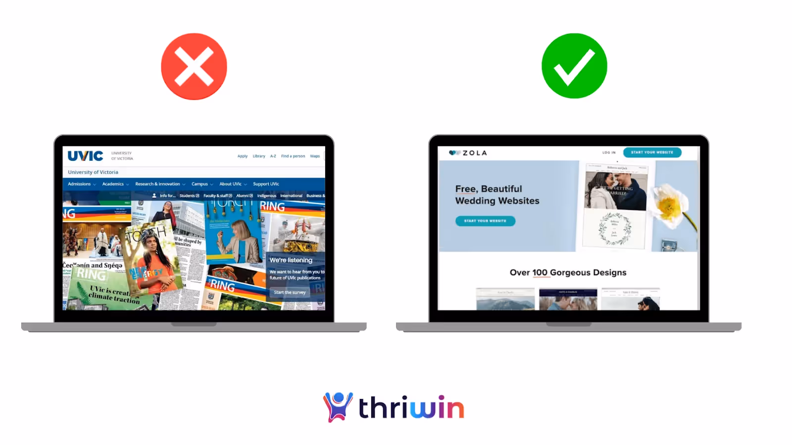
5. Cluttered Design (Mistake + Solution)
A cluttered landing page overwhelms users and distracts them from the core message. When a page is crowded with too many images, text blocks, or links, visitors may feel lost or unsure of the next step, causing them to leave without converting. In fact, studies show Too many elements can overwhelm users and lead to common mistakes in landing page optimization. Simplicity wins.
Solution:
Keep your design simple and focussed. Prioritize essential elements, such as the headline, value proposition, and CTA. Here are key tips for creating a clean, effective design:
- Use sufficient white space to guide the user’s attention to the key areas.
- Limit usage of colors and fonts to maintain consistency and avoid overwhelming users.
- Organize information logically using visual hierarchy, with clear headings and subheadings to lead users through the page.
- Remove unnecessary distractions, such as excess links or irrelevant images, so visitors can focus on the desired action.
A well-structured landing page encourages users to engage with your content and increases the likelihood of conversions.
Example: Bad vs. Good Landing Page Design
Bad Example:
- 4 different CTAs
- Cluttered layout with no spacing
- No trust signals
- Hard-to-read font
Good Example:
- One clear CTA above the fold
- Ample white space
- A single, strong value message
- Testimonial just below the fold
6. Ignoring SEO Best Practices (Mistake + Solution)
Ignoring SEO can severely limit the visibility of your landing page. If it’s not optimized for search engines, it’s unlikely to rank well, resulting in missed opportunities for organic traffic. Poor SEO can also affect user experience, making it difficult for visitors to find relevant information, which can lead to high bounce rates. Without SEO, your page won’t even show up. It’s one of the top landing page mistakes brands make.
Solution:
Incorporate basic SEO best practices to ensure your landing page is visible to both users and search engines. Key steps include:
- Keyword optimization: Use relevant keywords in your title, meta descriptions, headings, and content in a natural, non-stuffing way.
- Audience-focused writing: Craft your content with your audience's needs and preferences in mind, making it engaging and relevant.
- Image and video optimization: Ensure that all images and videos have descriptive alt tags and captions to improve search visibility and accessibility.
- Structured content: Organize your page with proper H1, H2, and H3 tags to create a clear hierarchy for search engines to crawl.
- Clean URLs: Use short, descriptive URLs that contain target keywords, improving both user experience and SEO.
These small changes can drastically improve your page’s visibility and help drive more organic traffic from search engines.

7. No Trust Signals (Mistake + Solution)
Without clear trust signals, visitors may hesitate to convert, as they need assurance that your brand is credible and reliable. A landing page that lacks trust signals such as customer testimonials, reviews, or security badges may raise concerns, preventing even an interested user from taking action. Visitors want assurance. Without trust signals, you're increasing bounce rates and breaking credibility—another landing page mistake to avoid.
Solution:
Include trust-building elements on your landing page:
- Customer testimonials or reviews provide social proof.
- Logos of well-known clients or partners to demonstrate credibility.
- Security badges reassure visitors that their personal information is protected.
- Case studies or success stories to show how you’ve helped others achieve results.
These elements help instill confidence in your brand, increasing the likelihood that visitors will convert into leads or customers.
8. Weak Headline (Mistake + Solution)
Your headline is the first thing visitors see, and if it’s weak or unclear, they may lose interest before reading any further. A vague headline fails to communicate your value proposition, reducing the chances of engaging visitors and driving conversions.
Solution:
Create a powerful, benefit-driven headline. This is another example of how landing-page-error violations impact the end-user experience when ignored. It should be:
- Concise and focused on the user’s needs or pain points.
- Action-oriented, using strong, clear language that connects with the user.
- Positioned above the fold, ensuring visitors see it right away.
A compelling headline instantly captures attention and encourages users to continue exploring the page.

9. Not Testing or Optimizing (Mistake + Solution)
Failing to test or optimize your landing page means you’re missing critical opportunities to improve its performance. Without regularly testing different elements, such as the CTA, layout, or images, you won’t know what resonates best with your audience, which can lead to stagnant or declining conversion rates. You can't improve what you don’t measure. Not testing is one of the most common mistakes in landing page optimization 2025 marketers still make.
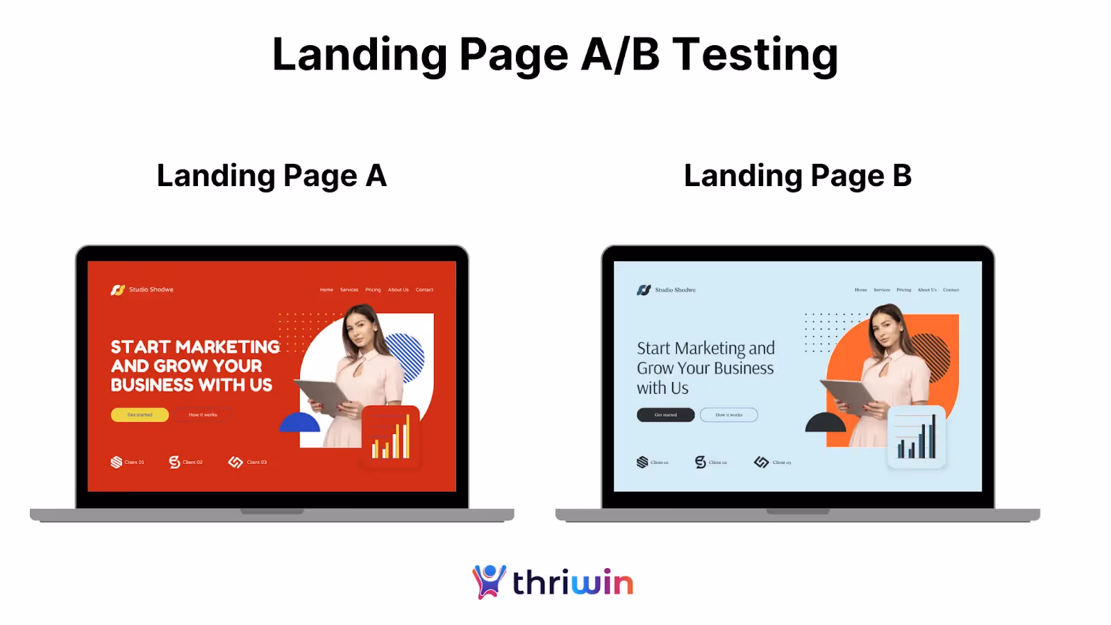
Solution:
Regularly run A/B tests on various elements of your landing page to see what performs best. Test different versions of:
- Headlines, to see which generates more engagement.
- CTA buttons, to identify the most compelling wording and placement.
- Images and other visual elements to find what resonates best with your audience.
Use tools like Google Optimize or Optimizely to set up and track your tests. Continuous testing and optimization enable you to enhance user experience and increase conversions over time.
How to Improve Your Landing Page Conversion Rate through PAA
Here are quick, research-backed ways to boost your conversion rate:
- Stick to one goal. Don’t confuse users with multiple CTAs—one clear action converts better.
- Speed matters. Even a 1-second delay can reduce conversions by 7%.
- Trust builds action. Testimonials and social proof lower hesitation.
- Test and learn. Run A/B tests on headlines, CTAs, and images to see what works best.
How Avoiding These Mistakes Boosts Conversions
Resolving common landing page issues can significantly enhance your chances of converting visitors into leads or customers. Below are some key areas where avoiding mistakes can make a big difference.
1. Faster Load Times Lead to Lower Bounce Rates
Slow-loading pages frustrate users and make them leave your site before it even finishes loading. Studies show that even a one second delay can cause a significant drop in conversions. By optimizing images, reducing heavy scripts, and using faster hosting, you can ensure your landing page loads quickly. A faster page keeps visitors engaged and makes them more likely to stick around and take action. Plus, search engines like Google reward faster pages with better rankings, bringing more traffic to your site.
2. Clear CTAs Guide Users to Take Action
A clear and direct call to action (CTA) is essential for driving conversions. Without a clear CTA, visitors may not know what they’re supposed to do next. Should they sign up? Download a resource? Make a purchase? A strong CTA button, with action-focused language like "Sign Up Now" or "Get Started," gives users the clarity they need to take the next step. Make sure your CTA stands out visually and is placed in a prominent location on your landing page to catch attention immediately.
3. Mobile Optimization Expands Your Reach
With most web traffic now coming from mobile devices, ensuring your landing page is mobile-friendly is no longer optional—it’s essential. If your page isn’t responsive, users on smartphones or tablets will experience distorted layouts, tiny buttons, or content that’s difficult to read, causing them to leave quickly. A well-optimized mobile page adapts smoothly to various screen sizes, ensuring an easy and enjoyable experience for users, regardless of their device. This improves both engagement and conversions.
4. Trust Signals Increase Confidence
People are naturally skeptical of unfamiliar brands, so providing proof that others trust your business is key to building credibility. Trust signals, such as customer testimonials, case studies, or security badges, reassure visitors that they are making a safe and smart choice by engaging with you. Displaying these trust elements prominently on your landing page helps reduce doubt and encourages users to move forward, whether that’s signing up for a service or completing a purchase.
5. A Simple, Clean Design Keeps Users Focused
A cluttered landing page can overwhelm users and distract them from the main message. Too many elements, such as excessive images, text blocks, or buttons, can confuse visitors and make them lose interest. A simple and clean design, with plenty of white space and focused content, helps guide users’ attention to what matters most—your value proposition and the CTA. Keeping your design streamlined makes it easier for users to navigate your page and understand exactly what action you want them to take.
By fixing these key issues and continuously testing your landing page’s performance, you can improve user experience, reduce bounce rates, and increase conversions. Even small adjustments can lead to big improvements in your landing page's performance.
Actionable Checklist: Improve Your Landing Page
Here’s a quick and simple checklist to help you fix common landing page mistakes and improve your conversion rates. Follow these steps to ensure your landing page is optimized for success:

This table organizes the key steps in an easy-to-follow format that is perfect for a downloadable checklist. Use this table as a handy checklist to review and improve your landing page performance systematically. By following these actionable steps, you can boost user engagement and drive more conversions.
Build No-code Landing Pages That Convert with Thriwin
Building a high-performance landing page doesn’t have to be complicated, especially when you partner with Thriwin. Our expertise in no-code development empowers you to create landing pages that are visually beautiful and optimized for conversion,without the need for complex coding or technical skills.
Thriwin understands that the foundation of a great landing page is its design and functionality. Their team excels in crafting clear and compelling value propositions that immediately resonate with the audience. Every element, from the layout to the CTA, has been carefully designed to lead visitors to take the required action.
Thriwin prioritizes mobile optimization, recognizing that significant traffic comes from mobile devices. Their no-code tools enable the creation of responsive and suitable designs for any screen size, ensuring a seamless user experience. Additionally, Thriwin focuses on fast loading speeds, which are crucial for maintaining user interest and fast loading times, which are critical for reducing bounce rates and enhancing user experience..
Curious how AI is reshaping no-code landing page creation and digital experiences? Explore how Thriwin is building with AI to streamline product development.
With Thriwin, businesses can build and launch landing pages that attract, engage, and convert into committed customers without writing a single line of code. Thriwin helps take landing pages to the next level, driving better results and achieving business goals.
FAQs
Q1. What should a landing page contain?
A great landing page should include a strong, benefit-focused headline, a clear call-to-action (CTA), concise copy, and trust signals such as testimonials or logos. It should also be mobile-optimised and visually clean to guide users toward a single conversion goal.
Q2. Why does my landing page have a high bounce rate?
High bounce rates are often caused by slow load times, confusing messaging, or a cluttered layout that overwhelms visitors. If users don’t immediately understand the value or feel frustrated, they’ll leave without engaging.
Q3. How can I improve my landing page’s conversion rate?
Start by simplifying your content, focusing on a single CTA, and removing unnecessary distractions. Regular A/B testing of elements like headlines, button text, and layout can help you identify what drives more conversions.
Q4. How many CTAs should a landing page have?
Ideally, a landing page should have one clear and primary CTA to guide users towards a single action. Multiple CTAs often distract or confuse visitors, resulting in lower engagement and fewer conversions.
Q5. What are the common mistakes in landing page design?
Common mistakes include using excessive content, having unclear CTAs, neglecting mobile optimization, and failing to include trust signals. These issues lead to a poor user experience and lower the chances of conversions.

.webp)